New Kermanshah Outskirts: Winning Best Infinity Terrain Table
Guest Post by Hugh W.
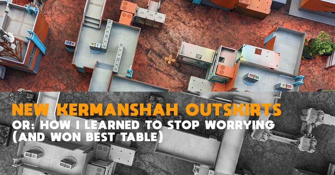
This is the story of how a shelf of terrain turned into a table voted 'best' at Burn City Brawl in Melbourne. I was having a hard time writing lists for BCB so I decided to spend the Sunday beforehand making a positive contribution (sorting out my table) rather than spinning my wheels trying to fit seven Morats into one core fire team.
My external constraints were 1) I don't drive so someone else needs to transport the table, and I want to be respectful of space in their car, and 2) nobody has time for mid-tourney adjustments - it needs to fit all five games on without changes.
In service of 1), I needed to sort out which terrain was going to be in use, and how best to condense it. I had a ponder and I decided that the Eternity Labs plus scatter was going to carry the day over the (admittedly more individually charismatic) one-off pieces on account of their stackability.
To best address 2), I set up my boards and mat, and plonked down the whole tournament's worth of objectives as the non-negotiable board elements - they can move vertically up and down the z-axis, but their lateral position is fixed and immutable. Because BCB had a mix of 12" and 16" deployment zones I also marked those thresholds on the table edge to make sure I wasn't locking either side completely out of parachutist options, or really hamstringing HVT placement.
Infinity Terrain : Table Layout
This section is pretty long, as I go through almost a building-by-building breakdown of how I did things. That’s dumb, so let’s highlight the decision points of my process.

I really like the idea of a table having distinct areas that can leverage different weapons and range-bands, and reward or punish different strategies and tools. Pursuant to this, I set up most of my planters to create a winding path along one (DZ-to-DZ) board edge as a starting point to work from. Let’s call this garden the southern edge of the table, with players deploying on the east and west faces. I imagined motorcycles screaming up the board, or warbands and light infantry using smoke to press up the board and doing combat rolls between garden beds.
An assault requires a defensive position to be assaulted, so I put a building looking down the board edge from the east side and a two-storey building on the centreline to limit how much board that defensive position could cover. I gave the west side rooftop bridge access to the centreline building, to offer a sneaky alternative to the sci-fi charge of the light brigade. That two-storey building on the centreline ended up with objectives on the roof, so I wanted to make sure the west side didn’t have exclusive access to them. I used some scaffolding to give slightly more order-intensive access to the rooftop, and to block out a little more of the board from that defensive hardpoint in the east.

I really like how the Brutal Cities bridges provide a lot of height variation and create quite an undulating rooftop play area, so I decided there was going to be a lot of roof access and z-axis movement options across the board. I ended up giving the Eastern side a *lot* of real estate that was very well protected, while I gave the Western side plenty of direct bridge access to rooftop objectives.
I used base sections on buildings in the corners of the East DZ to keep them 2” off the table edge allowing players to leverage Parachutist, over infiltration or impersonation to get unexpected angles on defensive pockets that are quite separate from one another. Conversely, the West has a much more contiguous ground-level layout.
I imagined out a couple of games, with particular attention on Mindwipe and Unmasking, identifying an attack run or defensive hardpoint and moving two silhouette markers around a bit to feel out how the lines of sight and range-bands shook out, which led to closing off a few corners with red-and-white barricades or free-standing servers - my priority was making sure that there was always a safe path from each DZ to the centreline, if a player were willing to consider cautious or prone movement and wasn’t too stuck on following their first plan.

Perhaps the clearest example of this kind of thinking is the northern objective rooftop, where an ARO bastard looking down from the southern rooftop could simply lock player two out of the game – I’m happy for plunging fire to be a strong play, but was concerned about it being a total lockout. I put bridges from both sides to the rooftop so models could move up prone instead of taking shots, I put some overlapping walls for total cover button access and set up some vault paths to enable more angles of attack. Suddenly the roof was so crowded that it was a struggle to move models around on! The solution was moving the whole building south a few inches so the mindwipe console had decent cover available on approach, and the acquisition comms array fell down into the alleyway behind – total cover and the rooftop is substantially less crowded than before.
Infinity Terrain: Table Legibility
Brutal Cities had done me a favour with the studio scheme for Eternity Labs, with visually striking grey and orange walls, and the pale rooftops to backdrop the miniatures that we’re playing with. My emulation of this was a good start, but a lot of my small stuff was in the same shade of orange as the walls. This ended up blending in and feeling a bit muddy, especially since I was asking players to expend a bit of brainpower to consider vaulting and climbing. I wanted to unify a visual language to connect z-level movement tech, after the style of Mirror’s Edge. My ladders are an electric blue that pops nicely against the orange so I rolled that out across almost all the ‘interactable’ terrain. There are some modular walls that need respraying to mark them as climbable, and one day I'll get around to pruning my planter beds so they're all at S6 height, but I think the whole thing is pretty visually cohesive.
I heard one story of a player bursting out laughing while leaning down to check a line of fire – my take is that if PanO is substantially Australian and the state is barely separable from its mega-corporations, then Bunnings has probably reached the stars, so the scaffolding is Bunnings-branded. It’s not really a table design thing but I’m stoked that my table has made someone laugh.

Actual Play, and Reflection
I'd thought through the shape of a couple of games while designing the table, but had my first actual go recently at new ITS14 mission Cryonics. I will spare you the blow-by-blow but the main surprise was that my maggie got spotlit and missiled without leaving the back line of the table, I realised that unpicking a strong hacking net would be excruciating on the table, and while I do think the table is a little too dense I feel vindicated in my belief that the too-dense failure state leaves more fun to be had than the too-open failure state.
To expand on that last: density empowers cheerleaders and warbands, but is unlikely to totally end a game on turn one. A too-open table empowers SWC weapons and the failure state is that the last SWC standing determines the game, perhaps at the top of turn one. On that front, I’m a little worried about an ARO Bastard deploying on the capsule houses in the north-west corner being a bit oppressive, but there are options to either close the gap in total cover down the northern or central ground-level lanes and engage within 16” so I’ll change it if I hear about it!
I had a really fun time making and playing on the table, and will continue to be proud to offer it up to my community for tournament play moving forward.
- Hugh

Thanks for sharing your write up Hugh!
If you're Interested, much of this table was made from the Eternity Labs Tournament Bundle with some Modular Capsule Housing and Modular Scaffolding
I loved your ideas for clearly delineating vertical access. It would definitely help to make a weekend of tournament play just a little bit less taxing on the ol' brain!
Kevin of Loss of Lt podcast had a similar Idea with his Vantann Office Buildings and other terrain - using red paint on the doors to make identification of interior access easy. Read about that here.
I really love the Bunnings reference, great idea.
I hope you found this article helpful. Got some great new terrain coming soon so make sure you're subscribed to our email list.
Thanks for reading,
Ryan
UPDATE: if you're reading this in 2024 - We have since released a bunch more different terrain options suitable for use as Infinity Terrain. Click the link for some Infinity resources, including painting guides and an overview of the different ranges. 


