
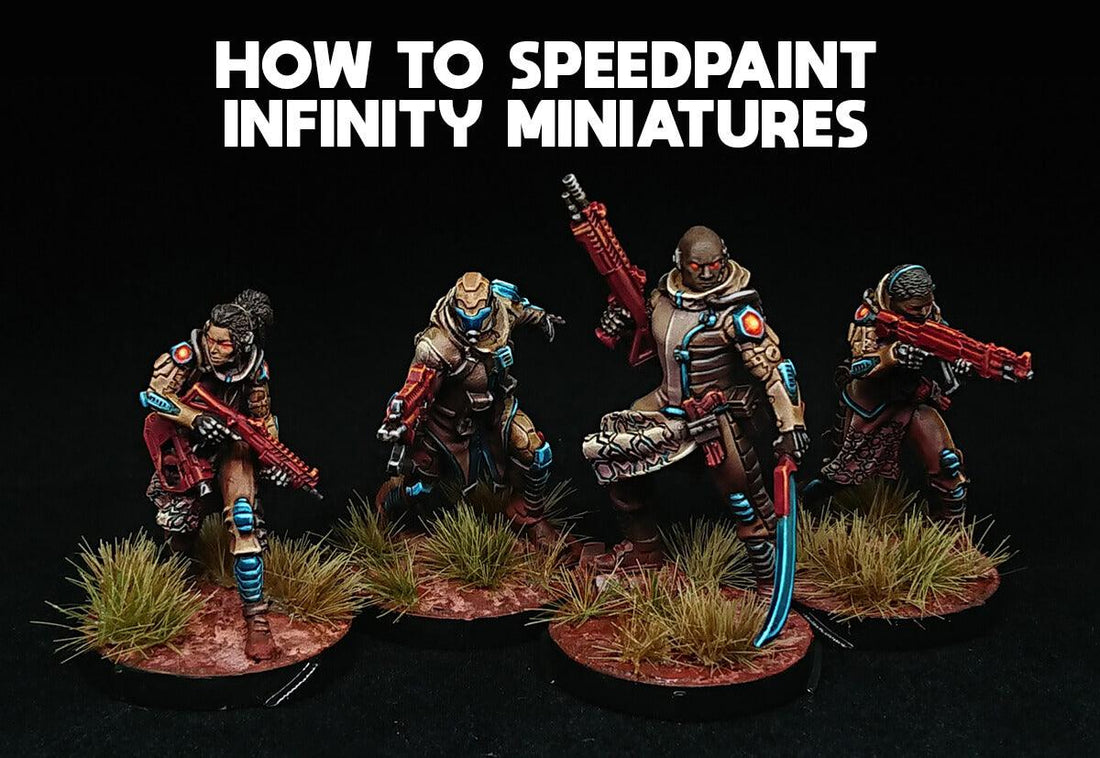
How to Speed Paint Infinity Miniatures
Michael Jagohow to speed paint miniatures - level up your slap chop painting!
Guest article by Tom Boele. Tom's a fantastic painter who regularly wins best painted army in Infinity tournaments in Australia. Even his guide on how to speed paint Infinity miniatures shows his impressive skill. Get your minis painted and painted fast.
Over to Tom! This is kind of like an advanced slap-chop method - read on and get painting!
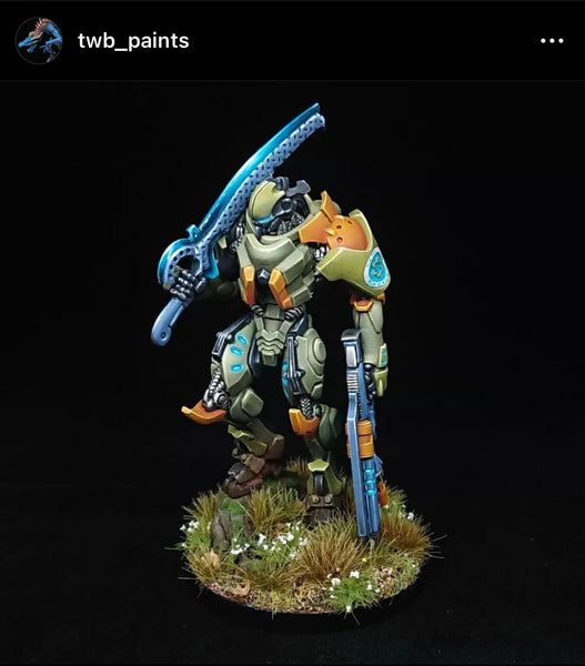
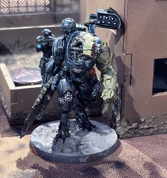
PanO TAG painted for Infinity the game painted by Tom - Follow at TWBPaints
infinity painting class recap
Firstly, thanks to everyone for coming for the first SITH painting day. It was really nice to have such a great turnout and I’m very pleased you were all willing to trust me to do a half-decent job of teaching a painting class. I hope you all got something useful out of the day, and to further help with that I’ve put together these notes on some of the ideas I wanted to try and convey. It’s probably a confused cross between a step-by-step and a collection of some tricks and tips for speed painting your miniatures but hopefully it reinforces any skills you learned that you’d like to apply elsewhere.
concepts for effective speed painting
Everyone would like an entire collection of beautifully painted miniatures. Painting beautiful miniatures takes time. Everyone is time-poor. Speed-painting for me is really all about trying to find the optimal compromise point balancing the time it takes to paint a mini and the quality of the finish. That means taking full advantage of painting techniques, colour choices and scale modeling products that give maximum impact for minimum time and effort.
In general terms that means:
- Painting techniques that let you leverage the shape and details of the sculpt you’re painting so that all the work the sculptor put into the mini helps your painting. Painting techniques that quickly leverage shape and texture include (but are not limited to) airbrushing, drybrushing and washing.
- Colour choices that go together into a coherent paint scheme that’s easy to execute. This one is probably easier to explain by offering counter examples - a perfect clean white, freehand harlequin patterns, camouflage prints and anything that requires precise control (either in colour hue or paint placement) over a large area to look right isn’t going to be easy to do fast. (More on colour choices later).
- Scale modeling products are especially good for weathering effects and basing your minis. Simple things like mud, snow and blood effect products can tell a story quickly and tie your minis into their surroundings. There are also special enamel and oil-based products that you can use to achieve definition or weathering effects at speed.
In the specific case of the SITH painting class, we looked to take advantage of aerosol sprays and drybrushing to make the most of the 3D features of the minis we were painting and looked to select colour combinations that were effective at adding interest without making the painting process more complicated. We didn’t get around to weathering or basing but I’ll add some thoughts on that at the end of these notes. We also didn’t really discuss planning as an abstract concept, so I’ll start the step-by-step notes with that.
“contrast” - using colour theory to speed paint
Before I dive into the step-by-step I wanted to quickly revisit some of the terms from colour theory and broadly how they can be applied to adding interest to miniatures. I won’t pretend this is a proper guide to the subject but rather a guide to what I mean when I use the terms.
Often when people ask for feedback on minis the response they get is “needs more contrast” but the responder is often unclear about what they actually mean by that. One way of thinking about colour is to identify 3 characteristics: hue, value and saturation.
Hue = what we usually simply call “colour” e.g. red, yellow, blue
Value = how light or dark the colour is relative to a grey scale reference (bright white = highest, dark black = lowest)
Saturation = How pure a colour is. The most saturated paints contain more pure pigment, while less saturated paints have white or grey mixed in that desaturates the colour.

One complication is that in practice all those variables are dependent on each other, i.e. generally when mixing paint you can’t change one without changing the others. For example, if you want to increase the value of a red paint for an edge highlight you might add white which will also drop the saturation (giving you a pink), or you might add yellow which will also change the hue (giving you an orange).
I think often the key to making a mini look striking on the tabletop is variation across the mini in all 3 of those colour characteristics. So there’s contrast between light and dark (value), between hot and cold colours (hue) and between vibrant and dull (saturation). I will also mention that you can add even more contrast across a mini by creating variation in texture and finish (think the difference between a matte coarse linen cloak and a glossy plastic visor) either by illusion through brush strokes or by application of specific varnishes. For the purposes of these notes however, we will just think about trying to maximise contrast in the 3 colour characteristics I’ve identified.
step 0: planning!
I think all successful miniature painting requires planning, and that it’s even more crucial for army painting. From a pragmatic perspective, for army painting you have to paint at least 15 and likely 40-50 of a faction for Infinity and way more than that for other game systems. If you’re actually going to paint that Silver Horde you need to come up with a scheme that you can paint, that you want to paint and that looks good when you’re finished.
You have to be realistic about not only what standard you can paint to, but how long that will take and if you have the time or will get bored and frustrated halfway through the job. I think important things to keep in mind include telling a story with your scheme, trying something new you haven’t done before to keep the element of challenge alive and choosing a scheme with strong visual impact that you really like when you complete each mini to give that little dose of motivation.
step 1: colour foundations
So, you’ve chosen the main colour or colours for your scheme and you know how you want it to read on the whole. But how to go about putting some ideas from colour theory to good use? And how to make sure that those ideas are easy to execute at speed?
The fastest way to get paint onto a mini with control is spray, either via aerosol cans or airbrush and the range of colours available mean that it’s possible to get a great head start laying down the foundations of hue and value with something as simple as a 2-tone prime. By that I mean starting by priming with your shadow colour all over the mini (or just focusing on the shadowed areas if you start with something like a grey primer all over) and then a highlight sprayed from the top.
The specific choice of your shadow colour might be determined by the environment your minis find themselves in (e.g. green for a forest, red for a martian desert) or by the final hue you want to achieve (e.g. warm vs cold white) but a good starting point if you are unsure is to consider the colours across from the main colour of your paint scheme. Some examples from minis I painted before SITH painting day:

Kusanagi was going to end up red, so I chose a dark green as the shadow colour and white for value. Green sits directly across from red on most colour wheels but blue is also effective for shading red.

For the Haqqislam minis I was painting I wanted desaturated earthy and sandy browns to be across most of the mini while a red shadow is introduced to keep the browns reading warm and give a sense of a red desert environment.

With an airbrush you can take this idea further and jump ahead to elements of steps 2 and 3 because you have more control. Sforza is painted in my ALEPH scheme which is all about the purple, which has neutral purple-black shadows but moves up to a slightly warmer midtone and highlight with the addition of a pink into the mix. Because this foundation for my ALEPH doesn’t have a great deal of variation in hue that allows the turquoise OSL effect to really stand out.
step 2: general light values
If you used an airbrush for step 1 you probably already have some deliberate light values in place and might not need this step. But if you don’t have or don’t like using an airbrush then you can achieve a lot with the humble drybrush. Drybrushing is often sneered at by miniature painters who think that because it was the first technique they learned, and it’s so simple, that it’s somehow lazy. I think in the last few years there has been a resurgence in appreciation for what it’s possible to achieve with thoughtful and skillful application of drybrushing, especially with the right tools and technique. Drybrushing is a great technique to speed paint miniatures.
The key (as with lots of painting) is to get the right paint consistency and amount of paint on your brush. Too much paint or too wet and it won’t pick out the details and will run into cracks and crevices. Too little paint and nothing happens. Too dry and the effect can end up chalky, which while effective for stone doesn’t look right on skin, cloth or smooth armour plates. With a blunt conical drybrush it is also possible to feather colour onto larger smooth surfaces and achieve blends not dissimilar to airbrushing (see Bohun for example work).
For our purposes the intention is to use this drybrushing step primarily to create value contrast, taking advantage of the details sculpted into the mini. Don’t be concerned about the contrast being too high at this stage, because the next step is to apply filters over the top that will knock back the lightest areas
 |

Here you can see I started with a totally red prime just to demonstrate what you can do with drybrushing alone. You will also notice there’s some of that chalky finish here that I talked about. Not ideal perhaps, but given how much faster this method is compared to highlighting everything in a traditional GW shade->midtone->highlight workflow I think it’s a compromise worth considering.

The choice of hue for the drybrush should also compliment the total effect you’re trying to achieve. While the hue will mostly be set in the next step, it’s still better not to have conflicting layers underneath - so if you’re trying to achieve a neutral or slightly warm highlight, as I am for these Haqq minis, then a cream and an off-white is a more natural choice for the drybrushing stages than a grey and a white, which might cool the final effect too much, and would be more appropriate for a predominantly blue scheme.
step 3: variation in hues and saturation
Applying semi-transparent washes that act as colour filters isn’t a new technique, but with the proliferation of painting products specifically designed for the purpose over the last few years the technique is now totally mainstream. GW’s contrast paints are the most popular example but many other companies have similar product lines. For our purposes the brand isn’t relevant, but it is important to consider the different properties and finishes that you’ll get with some products but not others. That’s because the intention of this step is to add variation in hue and saturation across the mini, while preserving the general values imparted by the drybrushing step and complementing the shadows from the basecoat.
To control this step you need to lay down thin, semi-transparent coats so you don’t totally obscure the underlying colours and values we spent time building up in steps 1 + 2. This will likely require finding a medium you like to use to thin down the hue you want to apply so you get the right consistency. I find GW’s contrast medium excellent, and a 1:1 thinned mix of their first generation of contrast paints is usually my starting point for a tinting effect. If you can’t find the hue you want in a contrast or wash product, I find thinning standard acrylics at about 1:4 paint:medium creates a mixture that behaves similarly to contrast paints you can buy.
Generally, it will be easier (and faster) to work from light to dark colours as you apply your filters. Your first filter might be a wash that can go over the majority of the miniature, then you move on to blocking out large areas of colour, before finishing this step with bright accent colours that you need to be careful not to get on the surrounding areas. If you want a much lighter colour compared to the rest of the scheme somewhere, that will likely require a new basecoat and although still possible will be slower than a scheme where you don’t have to return to a flat basecoat. Similarly, if you want to use true metallics, then laying down the basecoat metallic will be an extra step, and probably easiest to do before you put down any colour filters (just make sure to rinse your brush and wash pot before moving on unless you’re OK with making everything shiny).


Stylistically, you can use this tinting process to correct or exaggerate the colours established in step 1 if desired. That includes reinforcing the colours in the shadows if you’re really into the contrast effect you have created there.
Once you’ve finished this step you’re potentially finished! If you’re happy you can skip right to basing your mini and maybe giving it a coat of varnish to unify the finish of all those washes and contrast paints. Even if you intend to add extra detail later this might be a good place to leave your minis while you get the rest of your army to this level.
step 4: emphasising boundaries
Now you have all the main colours blocked out on your miniature, and it should be pretty clear how the scheme is going to come together as a whole, but some of the definition within those blocks of colour has been lost in the tinting process. To get that value contrast back, and to add extra colour nuances to further differentiate separate sections on the mini, it’s time to highlight.
Highlights can take a very long time and/or require technical skill to carefully place in the right locations on a miniature. Infinity miniatures in particular really benefit from crisp highlighting because they have a high level of intricate detail (compared to GW minis that often have larger flat areas where blending and layering are more important) but all that detail is very small. So far we’ve tried to take advantage of that detail via drybrushing but now we need more control.
The key to making the most out of a limited time budget for this step is to be very selective. Selective first about where you do put the effort in to highlight at all and second to select a highlight mix for maximum effect. For the first of those points, I think it’s something you learn through practice and carefully imagining where real light would create the sharpest reflections. For the second, I mean you should plan for only using 1 or at most 2 highlight steps, each very close to maximum value.

Here you can see I didn’t use a whole lot of highlights, but where I did use them they had specific jobs. The red highlights are deliberately orange and the blue highlights are deliberately a turquoise mix to increase the saturation in both those areas. In comparison the highlights on the various brown areas are relatively desaturated mixes, but I’ve still tried to further delineate between different brown areas by mixing in white/cream for the highlights for extra cold/warm variation between browns.
A tip for quickly getting the correct hue for your highlights in this workflow is to use the product you selected for step 3 to mix with white / off-white to create a highlight colour. Given that products such as contrast paints are just another mix of medium and pigment there’s nothing stopping you from mixing them up with regular acrylics. You should experiment to find the right fit for what you want and how you like to work.
An important element for painting crisp highlights is creating the right paint consistency (viscosity) and cure time. You want paint that’s thicker than you would use for a blending step (none of that milky stuff here) but you don’t want the mix to start to dry on your brush, otherwise it won’t transfer onto the sharp edges you’re trying to emphasise. Drying retardant and mediums are your friends in a world where acrylic paints are usually formulated to be thick and fast drying. Water-based paints are fantastic but that doesn’t mean you can only use water to change the way they behave to help you get the results you want faster and more easily. I tend to use a small amount of retardant (usually only as much as whatever brush I’m using for paint mixing holds) in all my highlight mixtures and add a little more if necessary if it’s a dry day or the pot of paint I’m using is a bit old and thick.
Again, like at the end of the last step, you can call your mini done after your limited and extreme highlights. But if you’re still after one more thing to make your minis stand out there are various fast ways to add special effects.
step 5: special effects
Now it’s time to have fun and if possible add real impact for minimum effort. Consider aspects of your mini that already draw the eye and focus your efforts there. Places like hands, faces, eyes in particular draw the human gaze but you can also manipulate your audience’s attention through your use of colour. Think about putting extra effort into these areas, adding OSL, smooth blends, texture or any other special effect you can think of. You can even make the total process faster if the special effect require less precise work. For example, it usually takes a long time to get eyes right, but OSL eyes are much faster and can add real interest to a face.
Taking OSL as an example special effect, it follows similar logic to the rest of the way we painted our mini: white underneath lays the foundation for the light value higher than its surroundings, then filters are added to give hue, and often fluorescent paints are used to give extra apparent value to strengthen the effect.
I won’t write down guides here because I know you can find better step-by-steps for things like OSL and various power sword effects elsewhere, but here are a few examples of the sort of thing you can try out across an army to add that extra level of pop:
OSL examples:


A couple of quick power-swords just 2-brush blended with contrasts:


step 6: basing infinity miniatures
As with the special effects step above, I won’t give proper step-by-step instructions here but hopefully convey the general gist. Basing makes a big difference to how finished a mini looks but it can take a long time that sometimes feels like extra time you didn’t really want to budget for when you started planning how you were going to finish your army. As ever, we’re after fast and impactful finishes, and I think this is where scale modeling products really come into their own. The bases I’ve made for all the example minis I’ve painted for these quick schemes follow this basic recipe (I got the idea from Henry at Cult of Paint):
- Acrylic mud product (Vallejo in this case but there are others)
- 2 different pigments
- Fixer
- Tufts
Just like painting, variation is useful, but remember you don’t want the base to steal the show. It should help tell the same story the mini is telling. This is definitely a situation where I think online comments clamoring for moar contrast can be misguided (would it be appropriate to base a winter soldier in a desert?). Bases I think are somewhere colours should generally be desaturated and darker than the mini, while the overall hues match the theme.

And that’s it. I’m sure I’ve simultaneously been too long-winded and missed out key details so please get in touch if you have any questions whatsoever. Again, thank you for coming to paint day and I hope you find these ideas helpful in your army painting.
______________
my own attempt at painting Infinity miniatures using tom's guide:
Thanks so much Tom, for such a great article!
His painting event in Sydney was really fun and great hanging out with other people even just for painting motivation. I've definitely been doing a lot more painting and more consistently. You can apply some of these tips to your terrain as well.
I painted the Infinity Loup Garou models at the class in about 2 hours (Painting time, as we were preparing and chatting for another 2 hours!) -
As you can can see, per sensei Tom's instructions, I sprayed a red coat on the underside. Kind of like zenithal. It helped make them darker and add interest.

I really liked the makeup brushes we used to give a fine drubrush and toms tips of using some moisture so the drubrush doesn't go too dry was a game changer!

Next time I think I will try and use thinner coats of contrast.
I used GW Arkhelian green for the turquoise, with a wash of Drakenhof nightshade.

Covered by the Zouaves in the ruins, the Loup Garou begin the hunt.
If you're also after tips to paint your MDF Infinity terrain, you might be interested in a free PDF with my MDF terrain painting method. It's fast, easy, and fun. Check out this blog post for more info.

We also have a new tutorial on How to paint 3d Printed terrain
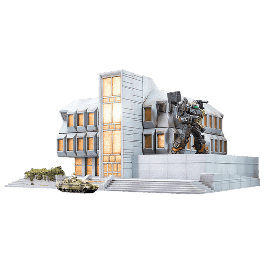
infinity terrain
If you're after some kits to expand your Infinity Terrain collection we have a variety of buildings that I've designed specifically for use as Infinity Terrain - Including our newest Fadelight range. The link above gives a good overview of the different ranges, and some other Infinity related links and articles.

2 comments
I enjoyed the article. Thanks a lot for sharing it.
Mastering filter techniques through transparent paints seems the way to go to me, to getting armys painted. People like you or Marco Frisoni from NJM proove, that it is quick and beautiful at once.
Thank you for taking the time to write this article!
Excellent article, thanks for sharing!