Painting Concrete Terrain Tutorial Part 1: Without an Airbrush
Ryan JagoShare

This tutorial will show you my approach to getting that weathered, worn, dystopian-flavoured concrete look on your miniature pieces primarily with bog-standard paint and brushes. While inspiration is taken from life, I don’t go for a super accurate look with my terrain pieces. I personally like an exaggerated, slightly cartoony style, as I think it looks nicer in miniature. However, these techniques can absolutely be used less heavy-handedly for a more subtle look if you prefer.
All of the process pictures on this tutorial are from my latest Brutal Cities purchase- two of the Cabbage Palms apartment block kits, as well as four Cabbage Palm Extra Floor kits. I wanted some more residential buildings for our sci-fi/near future table, and I’ve had my eye on these for quite a while!
Give them a go, see what works for you, and paint some lovely terrain!
STEP 1: PREP YOUR PIECES
If you’ve prepped MDF pieces before, feel free to skip this part. If you’re a beginner, though, it’s definitely worth a read.
I find this technique works best if you paint before assembly. It’s completely workable on a pre-constructed piece, but I find it’s much easier to take a production-line approach on flat MDF pieces than a fully constructed building.
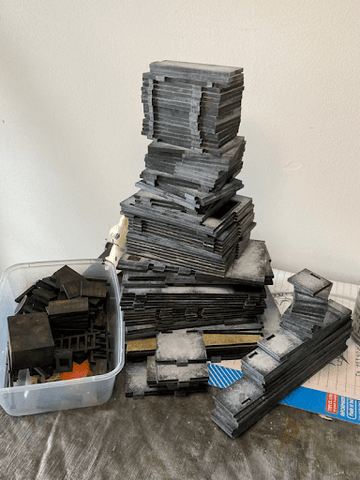
First things first- pop your pieces out and get rid of the join marks on the bits. When I started working on more MDF kits, I invested in a cheapo rotary tool after I got sick of manually filing and shaving down all the bits on a couple of big projects, which makes this process a hell of a lot less labour intensive. Use whatever method you like- knife, file, sandpaper. Just make sure you make a mask and work either in a hood or outside to avoid breathing in too much MDF glitter.

My wrists thank me for the purchase of a rotary tool.
You don’t have to sand them down perfectly- just enough that it feels mostly smooth when you run a finger over it. Once primed, these should be largely invisible. Sanding them down before priming also means that these little fuzzy parts don’t soak up paint and make assembling your pieces nice and flush an absolute nightmare.
Once the pieces are clean, it’s time to prime! Priming is super important as MDF is very absorbent. If you skip right to paint, it can absorb a lot (making the colours look more washed out) and swell or warp, which once again, makes assembly tricky.

Use of burner towels optional.
Prime all pieces, front, back and don’t forget to try and catch the sides, with a dark spray primer of your choice. I’ve been liking the Rustoleum paint and prime as it’s got great coverage, but any matte primer will do.
This technique works from dark to light, so prep your pieces in either black or a dark shade of the colour you want your completed pieces to be. If you only have light primer, you’ll need to paint a dark base coat for this technique to work.
STEP 2: ASSEMBLE YOUR MATERIALS
This step is less important if you are working on a small project, but I still highly recommend assembling your materials and, most importantly, pre-mix or buy your paint shades. It makes a project much easier to pick up and put down, and having everything pre-mixed in containers cuts down on waste from mixing on a palette every time you find some time to work on it.
As I’m going for a bog-standard, flat-pack building bare concrete look for my apartment blocks, I’m using a dark grey, a light grey, and a mid-tone made from an easy 50/50 mix between the two. I’m using some matte interior house paint sample pots as my base colours, but any matte acrylic will work. For most projects, I just use cheapo craft paint. Whatever you have to hand is fine. You can use this technique with any colour- just make sure you’ve got a dark shade, a mid tone, and a light shade.

With our powers combined, we have: mid-tone!
Spot details on the building will use paint straight out of the container, so making sure I have large volumes of it mixed and ready to go is less crucial than the stuff I’m going to use for the bulk of the project.
A few brushes in different sizes are useful for a project like this, as the concrete panels on the building vary in size. I recommend cheap house painting or dollar store brushes for this project. Under no circumstances should you use a nice brush for anything more than spot fixes.

*sad trombone noises*
Lastly, materials for weathering and adding a bit of lived in feel to the pieces. You’ll want a brown and black wash and at least one weathering paint of your choice. Decals and greeblies are optional, but highly recommended.

There’s really no nice way to take a photo of jars of wash, huh.
With the materials assembled, on we go to painting!
STEP 2: LOTS OF STIPPLING
On to our base dark prime, we will be applying our darkest shade of paint to each piece.
Our paint will be applied with a stippling technique, which is a fancy way of saying you’re going to stab the pieces with your brush 10,000 times.
Load up a small amount of paint onto your brush and apply starting in the middle working out towards the edges of each panel. You want the most coverage in the centre, becoming less opaque towards the edges. As this is our base colour and most of this will end up being covered, you don’t need to stress too much about being too heavy handed.
A video showing basic stippling technique, with the second layer of mid-tone grey paint.
Repeat for each panel on your piece. I recommend a good podcast or two.
Once your pieces have received a coat of the darkest colour, it’s time to work your way up through the rest of the tones you have prepared. Application is very similar between the colours- focus on the paint being heaviest around the centre of each panel and becoming lighter towards the edges. With each layer of paint, try to leave a little more around the edge of each panel to get a nice gradient effect. Make sure each layer is dry before starting on the next- as this technique applies paint pretty thinly, each layer shouldn’t take long to try, but working wet paint into wet paint will result in a softer, more blended look than intended in this tutorial.

An example of how the layers should look as you go, with the first shade of dark grey on the left-most panel, working to the lightest grey in the middle panel. The last two panels show washes and weathering, which will be covered later in the tutorial.
Don’t forget to do a quick dry-brushing of the edges of each piece as you go. This isn’t compulsory, but black tabs can stick out like a sore thumb on a completed piece. Making sure they have some paint on them as you go can save you a lot of touching up later.
By the time you get to your lightest shade, try to go lighter on the amount of paint. It doesn’t have to be completely opaque in the middle. A rougher application will make the concrete look more textured and lived in.
Repeat with all your pieces. That’s really all there is to it. You’ll find that you’ll quickly get a feel for how much paint you need for each size of panel. And if you find you’ve been too heavy handed on a piece, just re-prime or re-paint and start again. If a single panel looks dodgy to you, you can cover it up with greeblies, graffiti or weathering later. This is an incredibly forgiving technique.

Repeat til cry.
Don’t try to get every panel with an identical application of paint. I think variation looks much more realistic on a miniature scale than uniformity.
STEP 3: DETAILING & INTERNALS
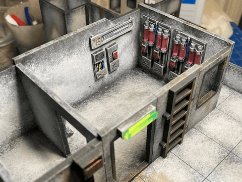
Once the base colours are done, this is the time to work on any details there might be on your piece. For this project, I’m masking off the symbols on the elevator shafts of each level, as well as painting over the window and door frames to match the ladders, window shutters, drains and air-con units I’ll be attaching later on.

For the internal walls and floors of the residential rooms, I decided to go for a Khrushchyovka beige. The painting technique is very similar to what we use for the external panels.
For the floor, a base of brown, a stippling of beige worked in while wet, a sparing application of ochre for grime and a final couple of washes gave the grimy carpet feel I was after.


For the walls, a base of brown and ochre was worked over with a few layers of beige applied in a cross-hatching pattern to give that old white-wash feel. A bit of white paint was sparingly dry brushed over to make it a little lighter compared to the flooring, as they ended up closer in tone than I wanted. I skipped the washes for the internal walls and just applied a little bit of weathering in the form of water marks.


For the tiles on the roof and entryway, I used the exact same technique as the concrete panelling on the external walls, but lightened by one tone, working from mid-grey, to light grey, with white as a final layer.

Finally, I painted the attachments. I decided that all window and door frames, the doors and windows themselves, air con units and ladders would all be the same rusty black for contrast with the light grey building. As I didn’t want to add too much time to this project, this was achieved with splotches of Vallejo Dry Rust effect paint and a generous dry brushing of Vallejo Rust applied directly over the black primer.

STEP 4: WASHES
I use a couple of Vallejo washes, watered down by about half. I find them a little dark to use on terrain as they are. Using two colours is optional, but I find that it adds a bit of extra grime to the buildings and prevents them looking too flat.
To each piece, I apply a layer of black wash, then add a few splotches of brown randomly while it’s still wet. Using a clean, damp brush, work the edges of the brown splotches to blend them a little with the black wash. Not enough to blend them completely, but enough that they don’t dry as bright brown puddles on each part.

Freshly applied wash- this should lighten as it dries.
Repeat, repeat, repeat again! Drying is the most time-consuming part of this step, so having a big workspace helps. Once all your panels are dry, it’s time for the most satisfying part! (Taking a moment to appreciate the amount of work you’ve done and panic about the amount of work left to do is no compulsory, but highly recommended.)

STEP 5: CONSTRUCTION
Putting together your kits after painting is largely the same as assembling unpainted, with a couple of important caveats.
Depending on things like the thickness of the paint applied, the tolerance of the kit, humidity, goblin mischief, faery magicks, etc, the tabs may now be too thick to fit as intended into their slots. Don’t force them as this can cause the MDF to delaminate. You can shave or file a tiny amount of paint and MDF off the tabs so they fit snugly.


Apply PVA sparingly along the joins and clamp pieces together if necessary while they dry.


And if you don’t have enough clamps, well…if it’s stupid and it works, it’s not stupid, right?
Look upon your works and know that they are good.

Taaaaall!
Now, these are looking pretty good! They are perfectly useable in their current state, and if you’re happy with them, apply a coat or two of matte varnish and off you go, ready for the table! However, if you want to go that extra mile, read on!
STEP 6: WEATHERING AND SPICE
Now we’re at the point of adding a bit of personality to the piece- making it feel like a lived-in part of a living city! Assembling your buildings before this step makes it easier to make sure your weathering looks right on the completed item.
Think about how the building is used and the environment it’s in. As I’m going for a cyberpunk near future with all the acid rain and pollution that that entails, water marks, drips and rust all feature heavily on my terrain. I used a Vallejo Dry Rust Effect Paint for my grime.
Buildings and especially metal weather most where they’re weakest- joins, bolts, edges. Keep this in mind as you apply your gunge.


If you are attaching gubbins to your piece, now is the time. If you’re working on a piece that comes apart, like this one, make sure that any drains or other plumbing line up before you glue. I’ve gone with a pack of air conditioners and lights from Brutal Cities, as well as some neat little flavour bits from Atenocities Workshop.


I’m using some graffiti decals on these pieces too to really hit home the neglected residential building feel. I will not be covering decal application in this tutorial as I always manage to stuff it up anyway.

Don’t forget to grime over your gubbins if appropriate!
STEP 7: DONE!
Apply a layer of matte topcoat and now we have a lovely concrete building to use in our lovingly created dystopian war gaming! Hooray!


This is a technique that can be used again and again. I’ve used it on a bunch of projects, either alone or combined with other techniques. Once you’ve gotten a handle on it, I’m sure that you’ll get all kinds of good ideas for using it on different projects, and if you do, please share!


The same technique worked in muddy grey and blue grey.
Thank you for reading this far, friends! If you have any questions or just want to see more of our work, please feel free to look us up on Instagram @OneCompetentHobbyist! And a big thank you to Ryan for creating such neat kits and asking me to write up this tutorial!
____________________
Thanks for sharing Georgia! Great learning how you make your terrain stand out so much! Click on the links to follow Georgia on Instagram and Facebook and give some support for her great work!
Part 2: With an airbrush will be up soonish. But in the meantime you can find a PDF guide on how I weather terrain with oil paints here


2 comments
@Karl – Glad to hear, yeah Georgia did such a great tutorial! There is inherently something more natural about painting with a brush vs airbrush, it feels more more intuitive and connected to your body.
Super Helpful and so clearly presented. This technique has been so much more effective than my newbie airbrushing attempts. Thank you :)